Beauty is an important part of today’s world. From a young age we are taught about physical features that are considered aesthetically pleasing or beautiful. According to Wikipedia, ‘being beautiful’ often implies attractiveness or desirability, but can also be distinct from either. In studies on facial attractiveness, symmetry has a positive influence on attractiveness ratings and plays an important role in sexual selection. By these standards, financial markets are rather ugly. While the financial world has caught up with reality in many regards, symmetry is still deeply rooted in many assumptions on models and methodologies. This also concerns the topic we discussed a few weeks ago: volatility targeting or volatility scaling. In this blog post I want to elaborate on the impact of misspecification for volatility scaling. Or in beauty terms: How bad will your allergic reaction be if you apply the wrong kind of make-up?
A quick recap
In simple terms, volatility scaling means adjusting the exposure of your strategy (or position) based on your expectation of volatility. One underlying assumption is that the volatility of your strategy correctly represents its risk. By targeting a (on average) fixed level of volatility a more attractive risk-return profile of the strategy can be achieved. Another reasons why volatility scaling is often preferred by investors is that it can increase the stability of returns and thus reduce timing luck. Both issues can be observed if we look at the subperiod performance of a simple buy & hope hold (left) vs a vol-scaled strategy (right).


The above risk-adjusted return triangles, which I created using the code provided by my good friends at Scalable Capital, visualizes the average annual Sharpe Ratio of two investments over a variety of holding periods. The holding periods are divided into calendar years. The rows represent the year of purchase and the columns the year of selling the strategy. A cell represents the Sharpe Ratio assuming that the investor buys at the beginning of the calendar year (y-axis) and sells at the end of a later year (x-axis). By moving to the bottom left, the holding period is increasing. The diagonal marks in form of steps mark 5-year investment horizons and allow for better visual identification of subperiods.
The chart on the left shows the unflattering truth of buying and holding the S&P Index (Total Return, USD). Your average risk-adjusted return can vary considerably depending on your entry and exit date. Things may get better in the long term due to positive momentum in Equities, but such an investment can cause many sleepless nights. Especially if you put all your retirement funds in it.
Similar to the real world, red dots go away with some powder. The triangle on the right shows the average annual Sharpe Ratios of a volatility scaled strategy. While there are some impurities for very short holding periods, overall performance is more consistent. The jury does not have to look twice. The winner of the beauty contest clearly stands to our right …
Opening the make-up toolbox
I have to admit that I cheated a little bit in this modeling contest. First of all, I pimped my contestant by applying a set of cosmetics recommended by most professional fund managers. Instead of natural beauty, the Botox of global diversification keeps this strategy’s skin wrinkle-free. Barely no financial crisis scars visible due to a combination of good genes global equities, bonds and commodities (trading costs are included).
In addition, I used plastic surgery financial research on volatility scaling. By applying a trendy overlay creme I harvested the combined benefits of momentum investing and volatility scaling. According to the paper “Time Series Momentum and Volatility Scaling,” by Abby Y. Kim, Yiuman Tse, John K. Wald, time series momentum alphas in futures markets are largely driven by volatility scaling (also discussed here), which makes the combination a highly successful mix.
Is this unfair? In some beauty contest, you can get disqualified when you use professional helpers for your make-up and hair. Well, while financial markets definitely have a “everything that helps to win” attitude, I believe in transparency. This brings me to the ‘quant’ content of this post and its relation to our previous article on volatility scaling. Sorry, the beauty contest is over, but don’t worry. Similar to Donald Trump, we will still be working with models.
In our article “The bittersweet truth of volatility targeting“, we already discussed the impact of volatility scaling on a Trend Following (TF) strategy. Our main observation was, that naively scaling a Trend Following strategy has some adverse effects on the strategy’s return profile. With our highly significant sample size of n=1 paths, we observed that applying target vol on a positively skewed TF strategy reduces this skew and somewhat diminishes the benefit of having it in the first place. The logic behind that was quite clear: At least for equity and bond markets, high volatility is associated with stress periods. This is one of the reasons volatility scaling works so well in the first place. Reducing exposure when volatility kicks in helps to avoid large Drawdowns. Due to the positive autocorrelation of volatility itself, some kind of predictability exists that can be exploited: periods of high volatility are more likely to be followed by high volatility and vice versa.
But while beauty is symmetric, volatility is asymmetric: “negative shocks at time t−1 have a stronger impact in the variance at time t than positive shocks. This asymmetry used to be called leverage effect because the increase in risk was believed to come from the increased leverage induced by a negative shock, but nowadays we know that this channel is just too small”*. And that is one of the reasons why things can get ugly. In general, volatility scaling does not care about your position. It assumes volatility is risk and risk must be reduced. However, what about having a portfolio of tail hedge strategies? Let’s say you are long VIX Futures. You would not want to scale this trade down once the VIX exploded, hell no!
The matter gets complicated: Underlying distribution play a role, the dynamics of volatility AND the direction of your trade. Oh boy!
Time to apply some Wabi-sabi. Haven’t heard of it yet? Well, let’s take a deep breath and concentrate. Wabi-sabi is one of the most important Japanese concepts of aesthetics and, yes, beauty. It is the ‘acceptance of transience and imperfection’.
Characteristics of the wabi-sabi aesthetic include asymmetry, roughness, simplicity, economy, austerity, modesty, intimacy, and appreciation of the ingenuous integrity of natural objects and processes. […] From an engineering or design point of view, wabi may be interpreted as the imperfect quality of any object, due to inevitable limitations in design and construction/manufacture especially with respect to unpredictable or changing usage conditions; then sabi could be interpreted as the aspect of imperfect reliability, or limited mortality of any object.
Sounds like a pretty good way of approaching quantitative questions as well. So let’s accept the ‘imperfections’ of our return distribution and start with same observations on the impact of volatility scaling on different return profiles. This time, I will not stop with n=1. Let’s make this a real contest. I will sample our contestants from three different classes of return distributions you might have seen before. Think of it as a contest between celebrities.
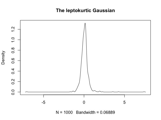
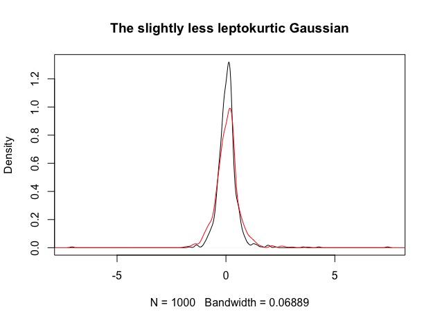
1. The leptokurtic Gaussian: The strategy has a positive average return and looks kind of attractive at first sight due to it’s symmetry. During the swimsuit contest, you spot a little bit more tail than you would have expected. Also it has this … strange bump around its mean.
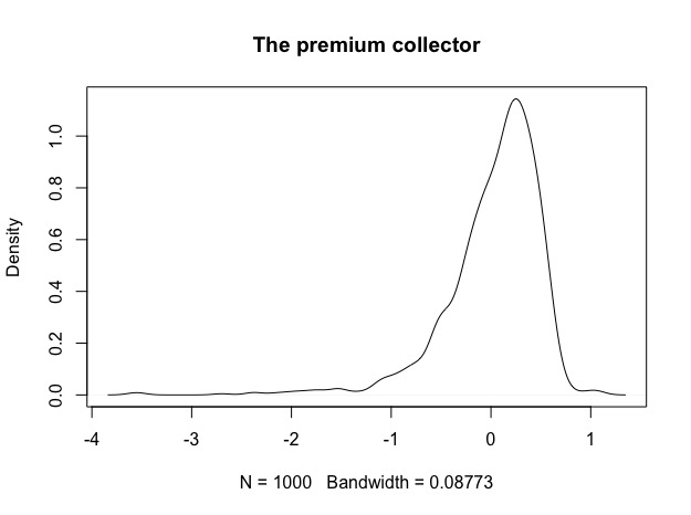
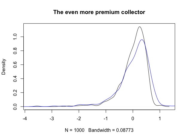
2. The negatively skewed Premium collector: It’s not symmetric (might this be wabi-sabi?), but it bribed the whole jury. It pays and pays and pays precious $$$, and makes you completely forget about it’s very very long and ugly left tail. The question for this one will be? Can it be tamed and if yes, what will be the price?
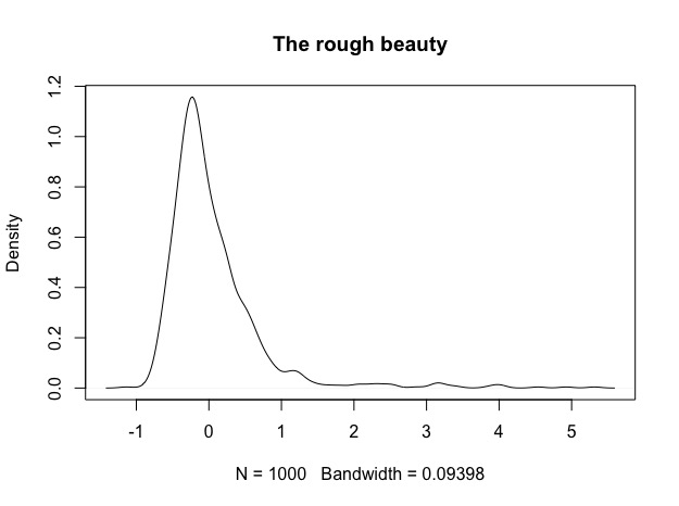
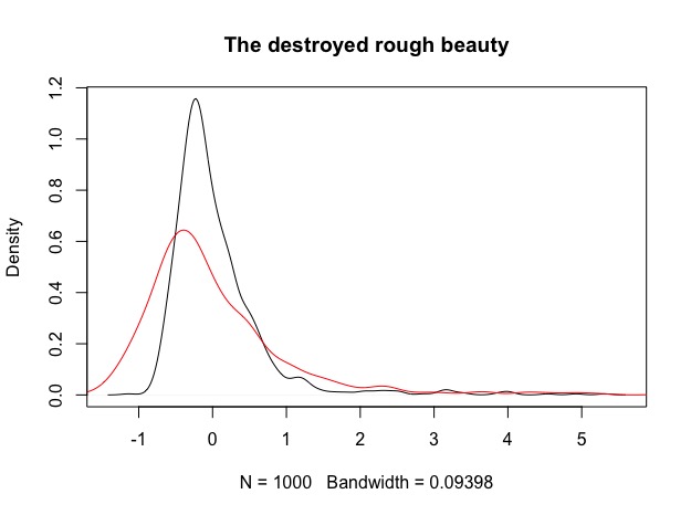
3. The positively skewed, sturdy and rough beauty: Now this must be wabi-sabi, right? We know this one from Trend Following strategies. Rough at first sight, a lot of volatility, definitely not symmetric but it has this benefit of the right tail. Are you willing to pay the price? Remember the triangle charts above. Roughness can also mean that you have to stay in this longer than you might be willing to do, however this might be true for any of the three contestants.
For the nerds: These are all examples of ARMA(1,0)-GARCH(1,1) processes with skewed generalized error innovations. Due to the GARCH process, these time-series exhibit prominent effects such as time-varying volatility (heteroscedasticity – bless you), volatility clustering and positive autocorrelation of volatility. The non-normal innovations let me play around with skew and kurtosis to achieve the desired return profile. Parameters were obtained from real world financial time-series and slightly modified so that each of the distributions has a similar mean and standard deviation. In contrast to what I mentioned above, I will not directly compare these distributions to each other, but rather simulate 1000 paths from each process, apply volatility scaling and compare the results before and after scaling. Special interest lies in the effect of this scaling on the skewness of the return distribution. Note that I did not simulate from an asymmetric GARCH on purpose. Asymmetry would play a role if we knew the direction of our trade. In this example, we only know which class our strategy belongs to, but not if returns come from the long or short side. Each time-series is N = 1000 observations long. I sample M = 1000 times from each of the processes just to make sure that what I see is not just me falling in the love with the results.
Ok, so long story short. Let’s see how these three look when we apply only a touch of vol scaling (from roughly 10% vol before to an average of 6% after):
1. The leptokurtic Gaussian becomes slightly less leptokurtic: Before (black) and after (red). Mass from the tails is shifted more to the center, as expected from the vol scaling. Roughly 52% of the simulations show sligthly increased skew positive skew, which does not really seem significant.
2. The premium collector now started bribing the audience as well. It gets even more negatively skewed, but also a little bit less bumpy. 75% of simulations have a larger negative skew than before the scaling.
3. The rough beauty is having a hard time. Is this an allergy against vol scaling make-up? 77% of simulations now have a smaller positive skew than before the scaling.
Why are results so mixed?
Well, the devil is in the details. First of all, I applied a very rough methodology of vol scaling and just used rolling historical volatility. While the simplicity of this approach is attractive, it misses many of the features of the true volatility process. The fact that something is off can also be spotted by looking at the height of the densities in figures 1 to 3. The post-scaling densities suddenly appear squeezed down. Succesful, volatility scaling should result in reducing the degree of variation, so we should expect rather more mass in the center of the distribution. Completely changing the shape of the return distribution was not what our contestants signed up for. The issue is less severe in case of the strategies with symmetric payoff profile (the leptokurtic Gaussian), but becomes evident for the skewed versions. For positively skewed distributions its worse for us as investors because we are scaling down the precious positive tail. While it seems like the methodology works for negative skewed distributions, in reality we just don’t feel the pain of misspecification. The premium collector has a bad rash, but all we see is smooth returns.
Can we do better?
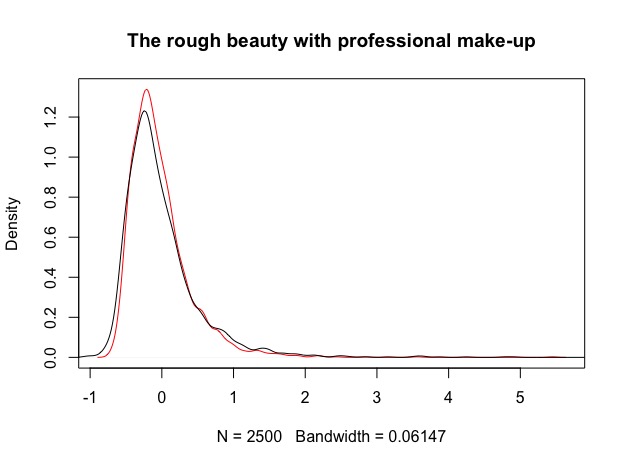
Yes indeed, but it requires some effort in finding a model better suited to the underlying volatility process. In the figure below, I used the same model from which we sampled the return processes and applied it to the rough beauty. Based on this model, it’s possible to to actually forecast volatility in the next period and use this as an input for volatility scaling. Results are definitely better in terms of shape and skew. Tails are reduced and mass of the distribution is more centered. Note that I increased the length of the simulation to N = 3000 and used a rolling window of 500 observations for forecasting the next day’s volatility out of sample. In all of the examples I disregarded implementation lag for simplicity.
In reality, we would have to deal with some additional problems:
- we rarely know the underlying strategy distribution, so we need some data (in my example 500 obsersvations) first to get at least a rough impression on what we are dealing with.
- more complicated volatility models usually have more parameters, which increases estimation uncertainty when you determine these parameters.
- in our examples we didn’t pay for the make-up artist. In reality, every adjustment is a trade that comes as a cost (slippage+commission)
Key takeaways
The concept of Wabi-sabi teaches us an important lesson. Before we can apply any modification to our strategy, we have to realize the imperfect quality of our work, the inevitable limitations in construction that make it unique. Like everyone of us knows his good and bad sides from a look into the mirror, we have to put our strategy under the microscope.
I do not consider volatility scaling a bad thing per se. I love the natural beauty of a strategy, but I believe that strategies can be improved by making their risk-return profile more attractive to serve different client’s needs. However, no methodology is flawless. So what can someone who wants to apply vol scaling actually learn from this except some philosophical ramblings?
- Asymmetry: Take a moment to look at your return profile before you apply vol scaling. Do your strategy returns look very asymmetric and skewed? What about the tails? Vol scaling works good with basic momentum strategies which are often portraied in the academic work. This does not mean it has to be the right choice for you.
- Intimacy: Where do your returns actually come from? Is it more premium collecting or do you count on your winners from the right tail?
- Instead of vol scaling on a portfolio level, you can also consider doing it for subsectors or individual positions.
- Roughness: Don’t scale too much. If you go from +35% ann. vol to +5% it’s very likely that return characteristics will change considerably.
- Simplicity: Most likely you don’t need the above mentioned more complicated GARCH models. An EWMA, which can be implemented in Excel is often enough to capture the basic effects of autocorrelation and vol clustering (actually, an EWMA is a subset of the class of GARCH models). A good idea is also to use different time-windows for vol estimation to increase robustness.
- Economy: Take into account the costs of vol scaling. A simple approach is by testing with different thresholds, e.g. only rebalance when daily vol changed by more than x%
So long and #happyscalingtrading!