This is an excerpt of the topic of the month “Flight to inflation” from our most recent Focus report. To read the whole thing and a lot more, check out our subscription options. If you like to stay updated on our blog posts and other free stuff, sign up for our newsletter!
When was the last time you were really worried about the economic reality of things? No, we don’t refer to the market’s daily capers. You know, the real world.
If you are working in the financial industry, as we do, things tend to get blurry after some time. We probably know more about the specifics of some exotic futures market (Jujube!) than about the retail prices of the underlying product itself. The only real exemption from this is very likely oil. For most other commodities the way towards final consumer good’s prices is a bit blurry. Do you keep a track of cereal prices via a representative index, tracking both your consumption as well as (average) prices?
Luckily, thanks to the U.S. Bureau of Labor Statistics (BLS) and other statistical bodies around the world, you do not have to keep track of prices yourself. Well, you do in some sense, because at the end of the day you still have to be able to pay your grocery bill. But the heavy lifting is done by several statistical agencies, which keep track of the average prices of consumer goods and services.
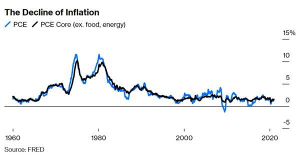
While Niall Ferguson remembers his childhood as the time when prices were rising significantly faster than his feet were growing (in the U.K. annual inflation hit 23% in 1975), during the last years we did not have to worry much about rising inflation numbers. According to Federal Reserve Economic Data (FRED), average core inflation has been 1.9% for the past 30 years. We do not want to dig too deeply into the question “Will there be inflation?”. There are some really good macro thinkers and researchers out there who offer insights into the workings of the monetary machine. Before Joe Biden signed the $1.9 bln relief bill, Goldman Sachs estimated the median disposable income will be 6-7% higher than before the pandemic by the end of 2021. This estimate was based on assumptions of just $750 bln of fiscal stimulus in 2021, which was expected to lead to at least a 10% increase in households spending power over the coming two years.
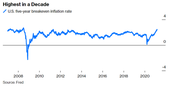
Based on the so-called breakeven inflation rate, which is derived from five-year Treasury securities and five-year Treasury Inflation-Protected Securities (TIPS), market participants expect inflation to be on average 2.45% over the next five years – up from 0.14% less than a year ago.
Clearly, inflation ranks highly on the Fed’s agenda – however in a completely different way. As Jerome Powell pointed out during an interview with CNBC’s Squawkbox in February 2021:
During the long expansion, many of us – and that includes me – were writing down a return to 2% inflation, and maybe a mild overshoot, year after year after year. And year after year after year, inflation fell short of that. So we have tied ourselves to realizing actual inflation.
The increase in yields had triggered a debate on whether the central bank would push back against the move. J Pow again emphasized his stance in a virtual press briefing on March 17th:
The stance of monetary policy we have today we believe is appropriate […] if you look at various indexes of financial conditions, what you’ll see is they generally do show financial conditions overall to be highly accommodative
The Fed rallied the troops, or as Janet Yellen put it on February 8th, 2021:
I’ve spent many years studying inflation and worrying about inflation, and I can tell you, we have the tools to deal with that risk if it materializes.
So, let’s follow Mrs Yellen and do some studying to understand some key concepts. There are quite a few ways to measure inflation. Most people look at the CPI (Consumer Price Index) as a measure of changes in the price level of a weighted average market basket of consumer goods and services purchased by a typical household. The YOY change in that index is often used as a measure of inflation by statistical bodies, politicians, and the media.
It is highly debatable what kind of goods and services should enter the calculation, and what weighting they should have. Other tricky topics include your place of living and the cost of education, which is usually not included. Anyway, smart statisticians have solutions (sub-indices) or arguments for these kinds of problems. For the moment, let us assume that the basket of goods and services is fairly well approximated.
The Federal Reserve prefers to use the Personal Consumption Expenditures (PCE). In contrast to the CPI, PCE includes goods and services purchased on behalf of households. So, if your employer bought a lot of disinfectant at work to increase your safety during the pandemic, that shows up in PCE but not in CPI. The PCE also uses different data sources for prices and weights, which are updated more frequently than those for CPI. If you are looking for a more diversified set of indicators for inflation, check out the inflation monitoring dashboard by the Man Institute.
J Pow mentions that he does not only want to achieve higher inflation, but he also hasn’t seen any noteworthy inflation during the last few years. At least according to our first chart, he seems to be right.
PCE YOY does not look like much compared to the 70s. A mere average of 1.59%. However, if you compound these values you still arrive at a cumulative rate of roughly 19% for the past ten years.
Real hourly earnings (adjusted for CPI) are more or less back where they were back in the 70s. Some economists argue that comparisons should actually start in the 80s since the high inflation period of the 70s was exceptional. Based on this starting point, real median hourly wages have only been slightly positive, no matter if CPI or PCE is being used. A mere 0.7% based on PCE and just 0.4% using CPI, see the figures below.
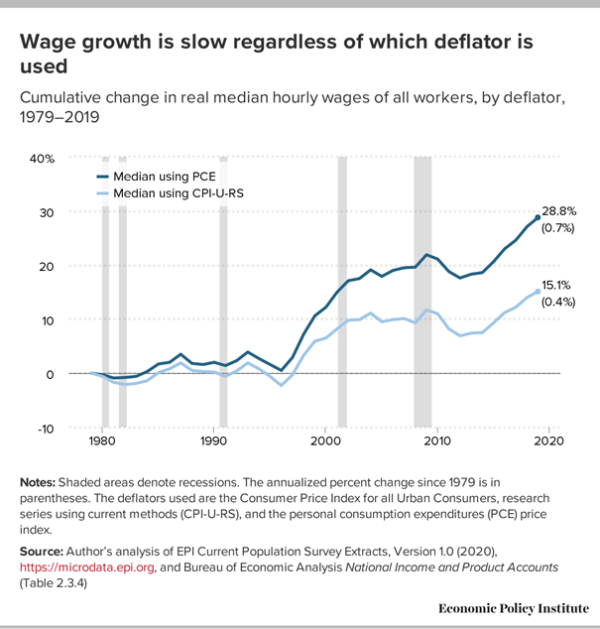
While real wages were slightly higher when measured against PCE, decent annualized growth has mostly happened for the top 5% earners (95% percentile).
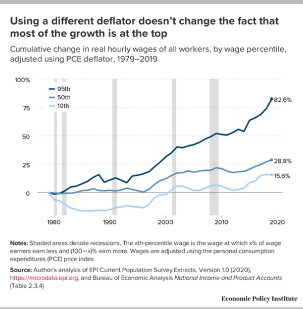
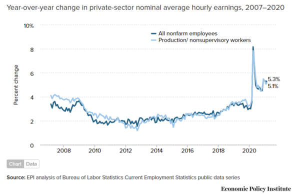
Hence, since 2007, the strongest wage growth has continued to be within the top 10% of the wage distribution. From 2018 on this accelerated further. So, all should be good, right? Wages seem to outpace inflation no matter which measure is chosen.
Ze Germans
You have to go back in time, to the invention of the CPI’s and PCE’s respective index methodologies to understand the economic logic behind their calculation. Both indices were initially developed by crafty Germans in the 1870s. Laspeyres developed the methodology that is used for CPI. Paasche invented another well-known methodology which, in parts, is used for the PCE. Most countries use similar methodologies to measure inflation, e.g. the HVPI calculated by the ECB is also a Laspeyres index.
The Laspeyres price index is a fixed quantity basket price index, with quantities held fixed in the price reference period. If the price of a good increases over the period, it receives a larger weight in the index going forward. Laspeyres assumes that consumers do not substitute, i.e. replace items with relatively large increases in price with alternatives.
The Paasche price index on the other hand is based on certain assumptions about “normal” consumer behavior. Economic theory and empirical observations suggest, that consumers, in response to relative price change, will adjust the quantities of goods and services they purchase. When the prices of a product that’s usually purchased rises relative to similar products, consumers will substitute/replace that product. The opposite phenomenon occurs when relative prices fall – consumers will purchase more of the product with the now lower price and less of the now more expensive product. This consumer reaction to price movements is the theory underlying the downward sloping demand curve.
While this theory may apply to for non-essential goods, it may not hold for the most essential components in the index. Take housing for example. Since January 1983, housing prices were replaced with owners’ equivalent of rent. It was just too inconvenient to have the reality of bubbly real estate markets distort the nice and behaved index. While housing makes up for a large part of the CPI (42.4%), it only accounted for 16% inside the PCE in 2020. A similar effect can be observed for transportation (15.2% of CPI, 3% of PCE). These differences seem to be driven by the assumption of substitution effects in PCE.
According to the U.S. Bureau of Labor Statistics, prices for housing were 62.03% higher in 2021 versus 2000. We don’t know about you, but substituting housing seems to be a little bit trickier than changing your favorite cereal brand because of a recent surge in prices.
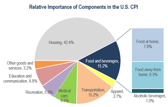
While the Fed likes their PCE, people trade on headline CPI. Based on the weights in the figure above, if housing and healthcare costs are rising, the CPI will rise significantly. The S&P CoreLogic Case-Shiller National Home Price NSA Index, which tracks price changes of single-family homes, indicates that in November 2020 housing prices had risen 9.5% from the previous November, see the figure below. This seems to be driven by increased demand due to falling mortgage rates.
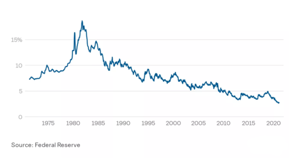
Starting in 2008, health care spending growth slowed to a similar rate as inflation and remained relatively stable at about 3% growth per year. But in 2014 and 2015, health care spending began to grow more rapidly with the Affordable Care Act, before slowing once again in 2016 and 2017. Per capita health care spending slowed slightly from 2018 to 2019, declining 0.1%. The pandemic led to a historic decrease in health care spending due to social distancing and the delay or cancellation of elective procedures. In the second quarter of 2020, health services spending fell by -8.6% over the second quarter of 2019. Since illness does not magically go away and healthcare costs tend to rise in an aging society, spending should pick up again after the pandemic. Based on the assumption of health not being easy to substitute, this should drive up CPI.
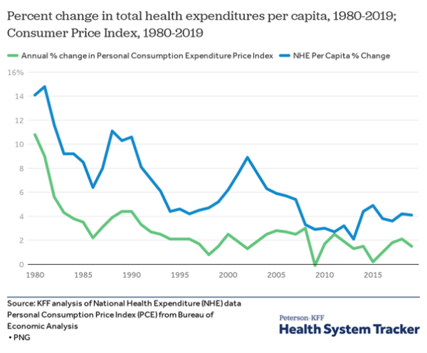
Due to the lower weight of both components in PCE, it is likely that people will see higher inflation (CPI) in the media, while in the eyes of central bankers all is good and as a result, fiscal tightening will not occur until inflation becomes very obvious. That is our base assumption: higher inflation without an initial reaction from monetary policy. Since we can only guess when and how central bankers will react, we like to have a portfolio of trade ideas that cover various scenarios.

